You are a New Zealander who has been based in London for nine years. What made you move to the UK?
I did consider other cities in Europe, and around the world, but at the time London seemed to offer the best of so many of them. It really is a global capital for design and culture, and at the time most of the studios I thought were exciting; Industrial Facility and BarberOsgerby for example, were based here.
My first job in London was with Priestmangoode, a design consultancy working in transport on projects around the world, which was a great follow on from my work at Formworks on Air New Zealand’s Sky Couch and Spaceseat
Since you have been in the UK you have held some high profile positions with the likes of Tom Dixon and Conran + Partners. What are the main learnings that you have taken from these experiences?
Working for Tom was a huge influence on my career as a designer. I guess one of the main things I took away from working in his studio was that the commercial aspect of a project needn’t hinder creativity, in fact it can be a real driver for innovation. I also think Tom’s polymathic approach to the business of design is quite complementary to the way I feel many New Zealand raised designers work; in having a certain energetic curiosity for trying their hand at everything, rather than feeling comfortable in a particular specialisation.
Another key lesson I’ve learned is that a designer who strives to have empathy for all the functions that surround bringing a product to market… distribution, sales, marketing… is able to exert more influence on the way their vision makes it into the hands, or homes, of the customer.

You’re also tutor at the RCA on the Design Products MA course, can you tell us a bit about that?
Yeah, I’m a one-day-per-week tutor on the Design for Manufacture platform. It’s a real honour to be teaching on the course that counts the likes of Jasper Morrison and Konstantin Grcic amongst its alumni. I get to mentor some seriously talented young designers, which really keeps you on your toes. It reminds you to be as rigorous and critical in your own work as you’re telling your students to be with theirs. You also get a deep insight into so many other ways of approaching design, which helps you to keep an open mind about the profession as a whole
You began your own design studio in 2015 and have just designed the Bloom Pendant for Resident, which was released at Milan Design Week. Tell us about that product?
Bloom was actually the first lighting product from the studio to go into production, and I’m super happy that it’s with Resident
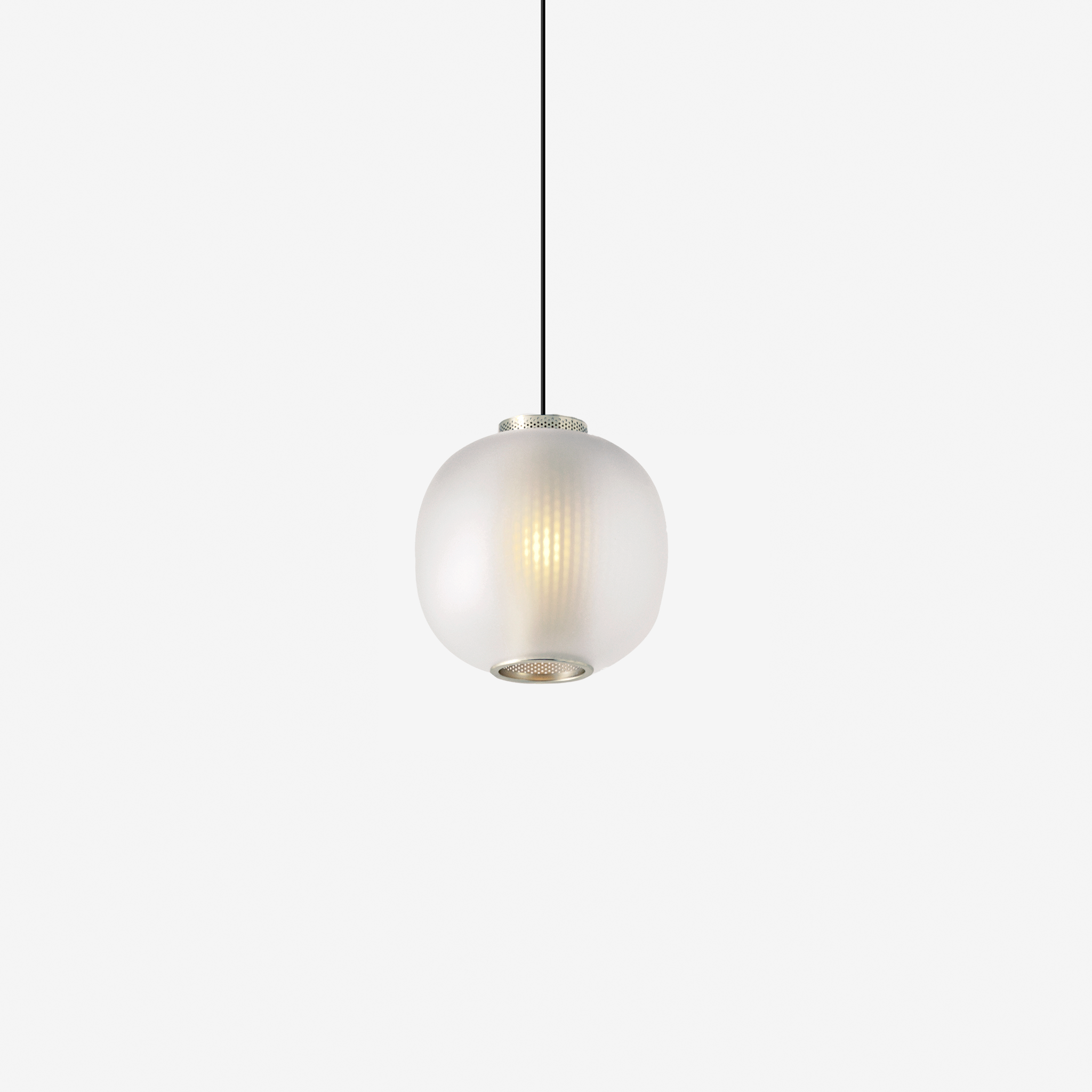
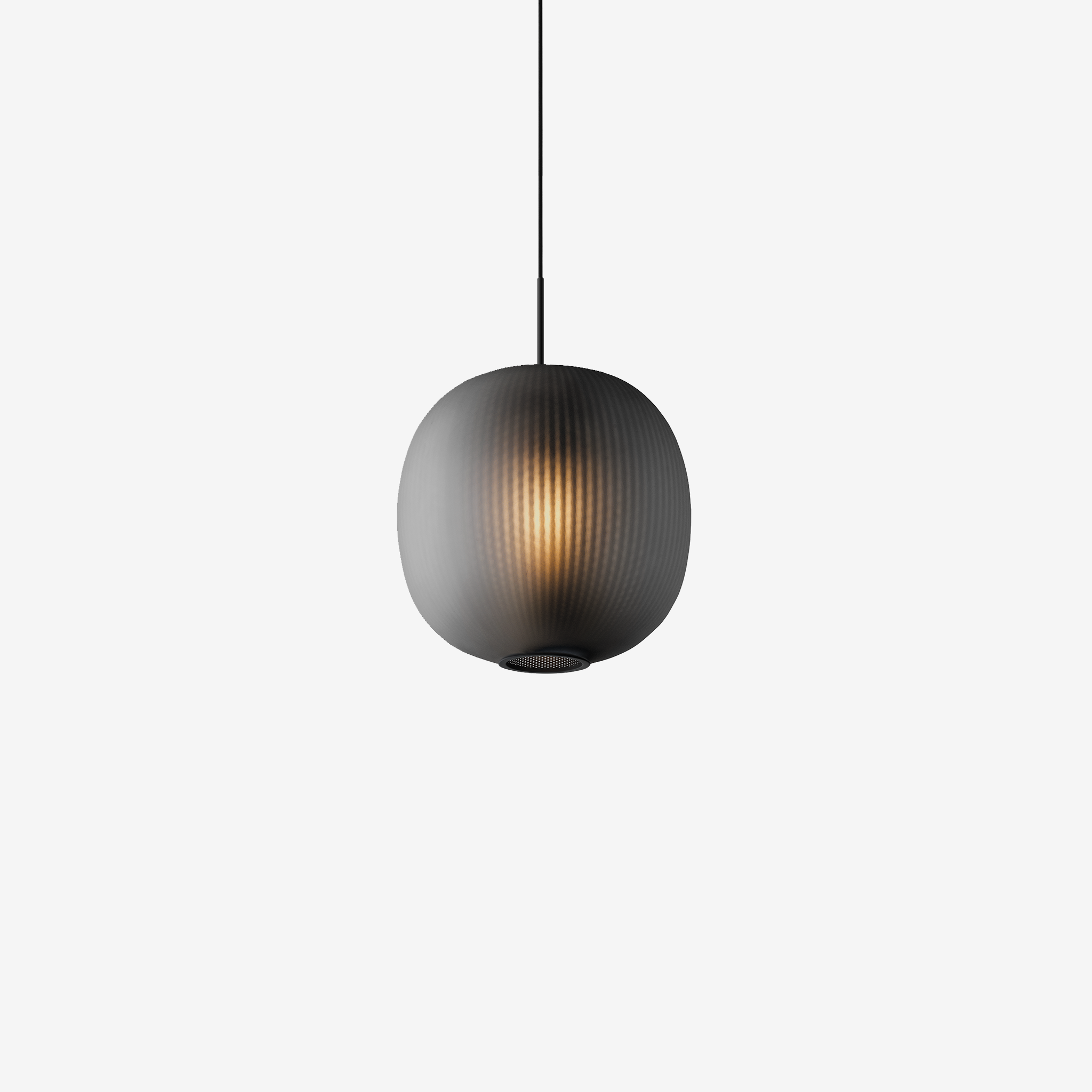
It’s a glass and steel Pendant light that uses a perforated mesh core to filter the indirect light, projecting a soft texture onto the blown glass diffuser; making it look, at first glance, like textured glass. We’ve intentionally retained an unbroken beam of light projecting downwards so that the functionality isn’t compromised.
We have produced a white version, with clear frosted glass and a nickel plating that adds warmth without feeling too flashy, and a moodier black version with black nickel plating and smoked glass. The overall form and the gentle lit effect calls to mind paper lanterns.

Its such a simple idea, but actually very original. What were your biggest challenges in executing the design?
Coming up with a good idea to start with is always the first challenge, but when designing a lighting product I always try to start by considering the lit effect itself. This normally involves lots of experiments and playing with various materials and light sources, often before I’ve even picked up a pencil, and Bloom was a direct result of this process.
Once the idea was clear and fully formed as a product, there was a process of emails and sketches and 3D files flying back and forth between Resident and the factory technicians to make sure the detailing was just as we wanted, and feasible for production. This is a fairly typical part of our process as we’re not a studio who likes to step aside once the product development phase kicks in. The manufacturing and materials really drives a lot of what I do. I’ll often have a feeling for the materials and processes I want to use before the forms are really defined.
Where do you see the Bloom Pendant being most used?
I think Bloom is one of those products that has a personality appropriate for a range of spaces. It could hang in an aesthetically traditional space just as comfortably as somewhere more minimal. In larger spaces I could definitely see it being used in multiples, with un-uniform spacing and height. I also think the black version would be perfect for slightly darker atmospheres such as bars and restaurants.
What can people expect from Tim Rundle Studio in the future?
I have a couple of projects in development with some really great brands from both hemispheres. I've recently been working on a really exciting new lighting project with the Danish design brand Menu, which will be launching very shortly. And plenty more projects with Resident too.


